

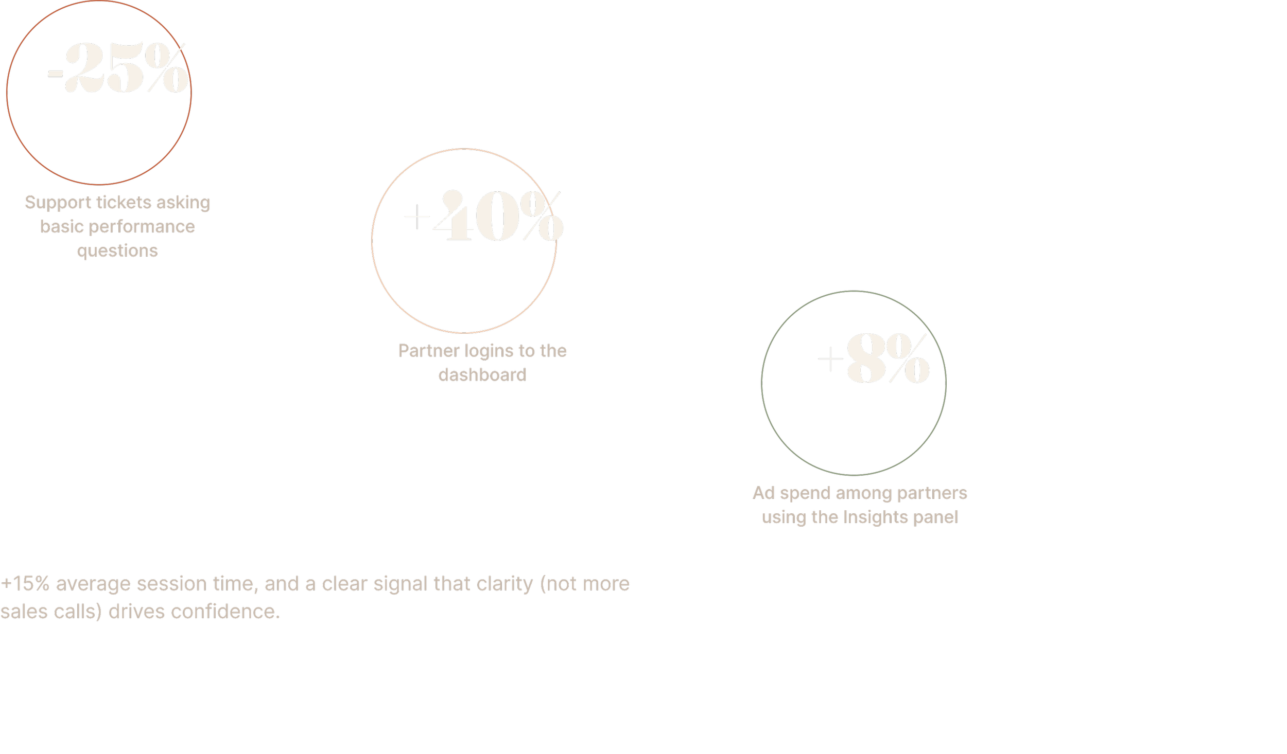
Empowering partners with self-serve insights to reduce sales support tickets by 25% and increase ad spend.
The Cost of an Opaque Dashboard
The Expedia Group TravelAds Portal is how thousands of hotel partners manage the advertising campaigns that drive bookings on Expedia.com, but the legacy dashboard wasn't earning its keep. Partners couldn't see what was working, so they stopped trying to find out and called their sales rep instead.
That habit was expensive. Sixty percent of inbound support tickets were partners asking some version of "is this number good?" Multiply that across thousands of partners, and you get an account management team buried in repetitive questions instead of strategic ones, and a TravelAds program that couldn't scale.
I was brought on as co-lead UX designer to turn the dashboard into something partners would trust enough to use on their own..
Role
Lead 2 UX Designer. Partnered
with research, content, product, and engineering.
Timeline
3 months
Team
Two UX Designers, Content Designer, UX Researcher, Product Manager, Analytics, Data Science, Engineering, Legal.

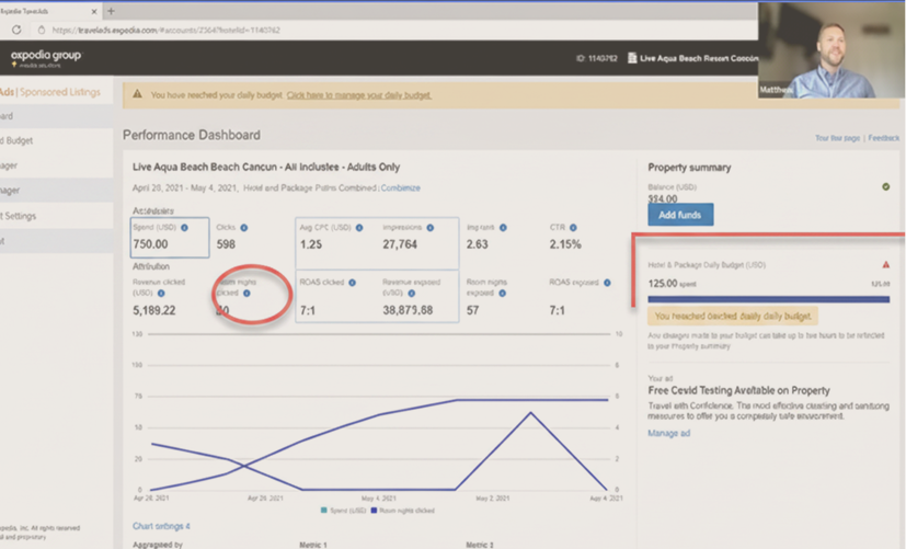
Legacy dashboard view for hotel property.

Finding the Real Problem
Our working assumption going in was that partners simply needed more data surfaced. Three research threads told a different story.
A heuristic evaluation of the existing platform exposed a confusing technical hierarchy — campaigns, ad groups, keywords, and bids were all visible, but their relationships to each other weren't. Interviews with 15 partners surfaced the same frustration in almost the same words. One partner put it plainly:
"I see I got 10 clicks, but is that good? What should I do differently? I end up just calling my sales rep because it's faster than figuring it out here."
When we pulled support ticket data, 60% of requests were partners asking for basic performance clarification — not bugs, not feature requests, just "what does this mean."
The insight that reframed the project: partners didn't have a data problem. They had a context problem. They were looking at numbers with no story attached, so they defaulted to a human who could tell them one.
Setting the Design Drivers
That insight gave us two clear mandates for the redesign:
From data to narrative
Partners needed a clear story about their performance, not a spreadsheet of numbers they had to interpret themselves.
Enable self-sufficiency
Every design decision had to reduce, not add to the support burden the research had just quantified.
We framed the work around one question: How might we give partners a self-serve dashboard that turns raw data into a trusted tool for optimization and growth?
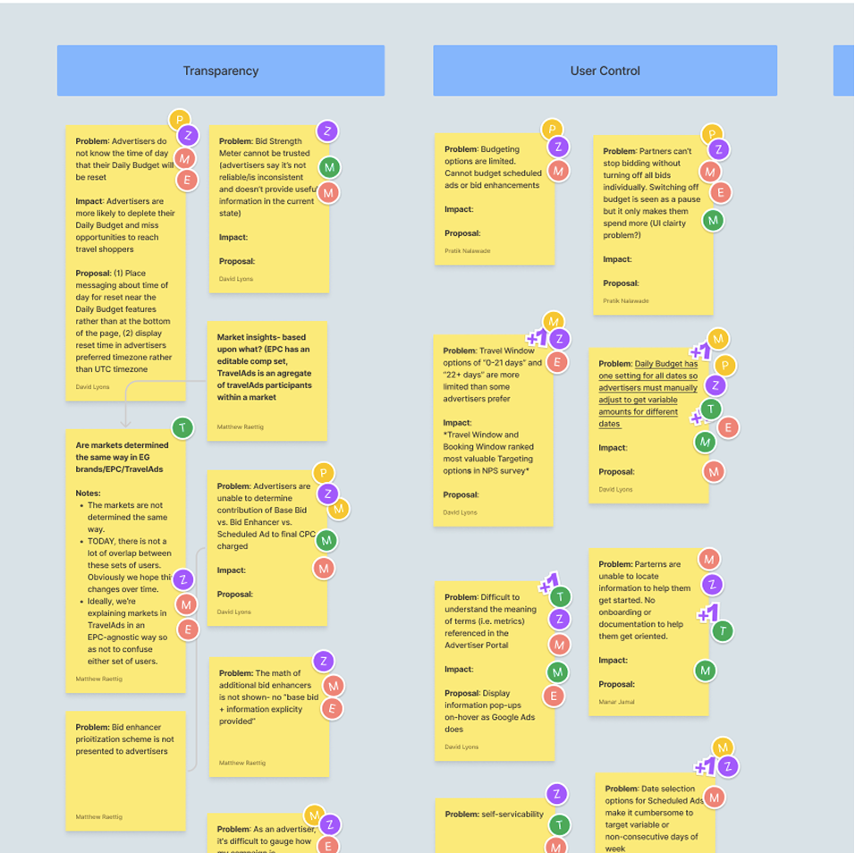
Stakeholder remote workshop.
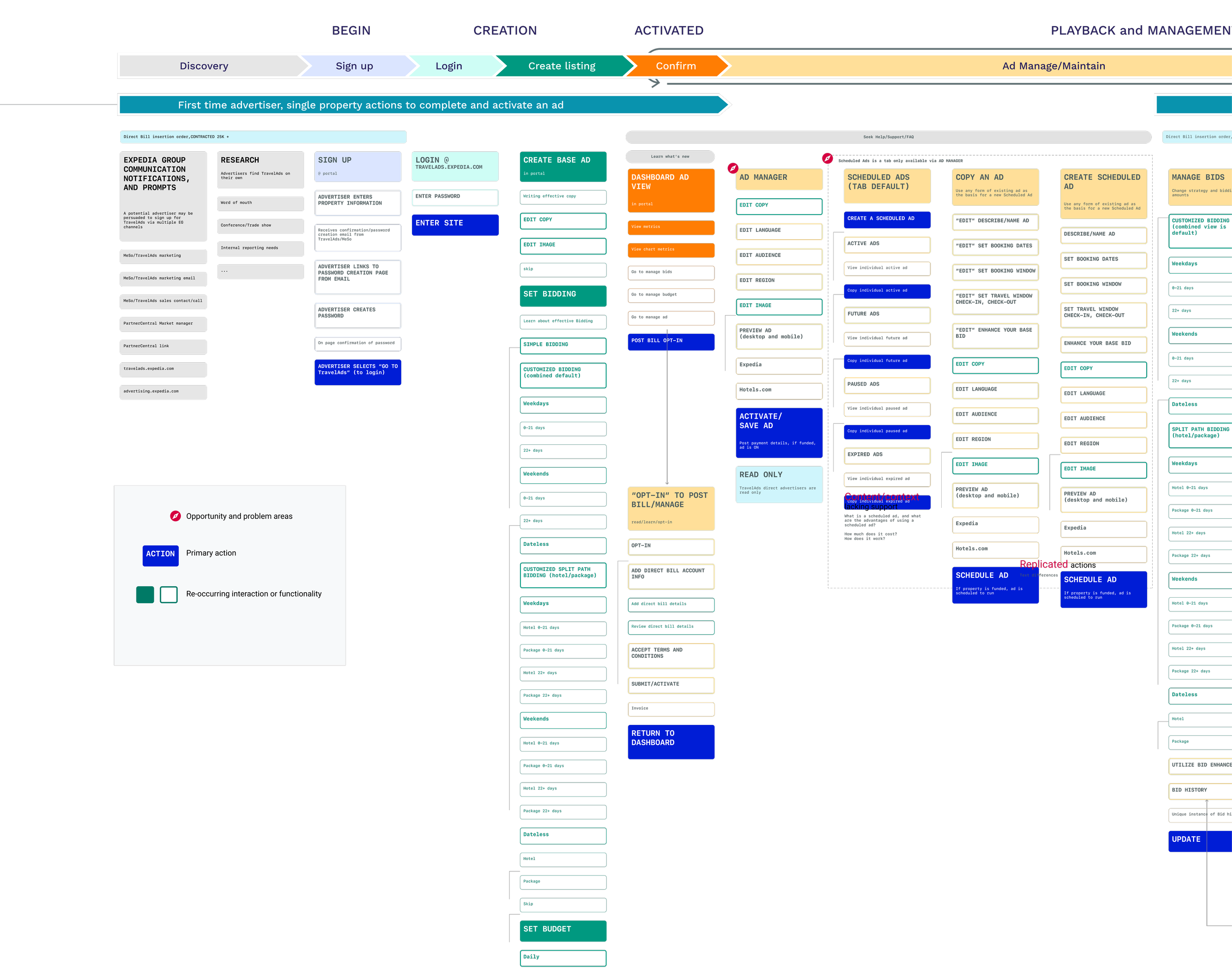
First time advertiser, single property actions to complete and activate an ad using TravelAds platform.
How We Got There
“TravelAds is a beast, but it doesn’t have to be.”
Designing Inside Real Constraints
None of this got built in a vacuum. Three constraints shaped every decision
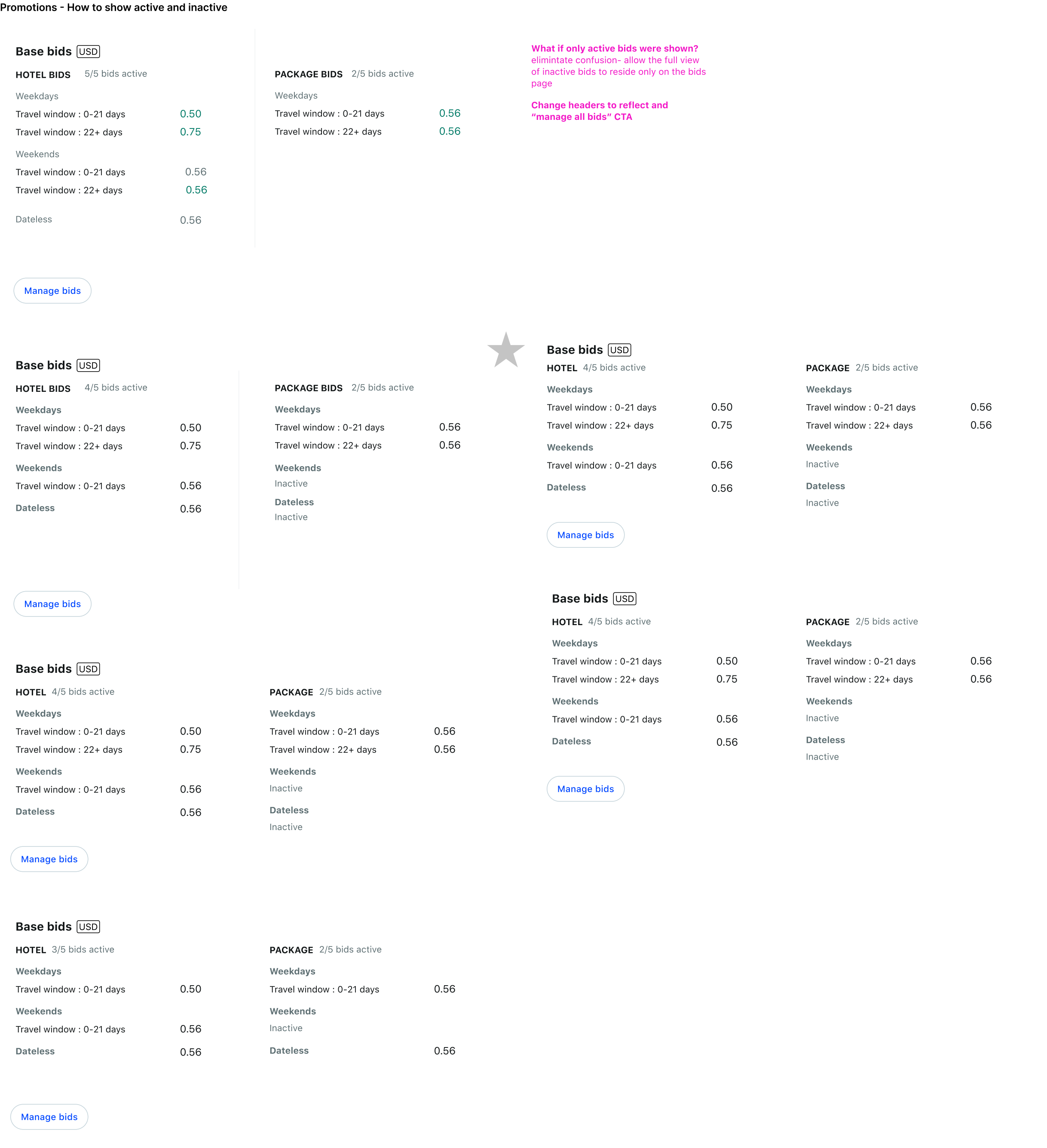
The new design system maintained consistency but constrained UI flexibility, so I adapted ideas to existing components.
Backend limitations prevented surfacing every partner metric, so I designed scalable information architecture to add data later.
We prioritized features with the PM that aligned to our two design drivers, phasing others for future releases.
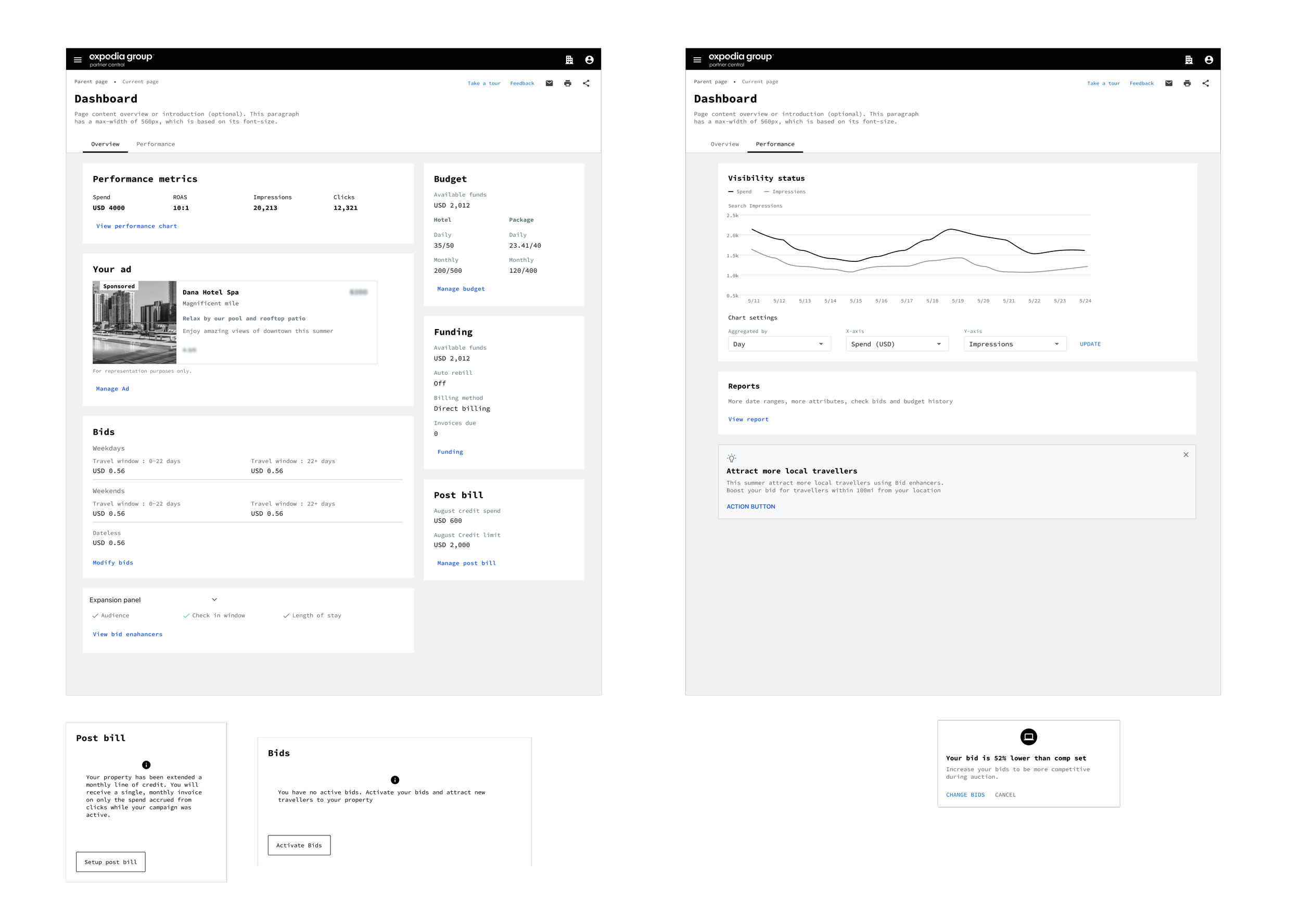
From Wireframe to Working Prototype
We restructured the dashboard's information architecture around a simple, logical hierarchy partners could actually read:

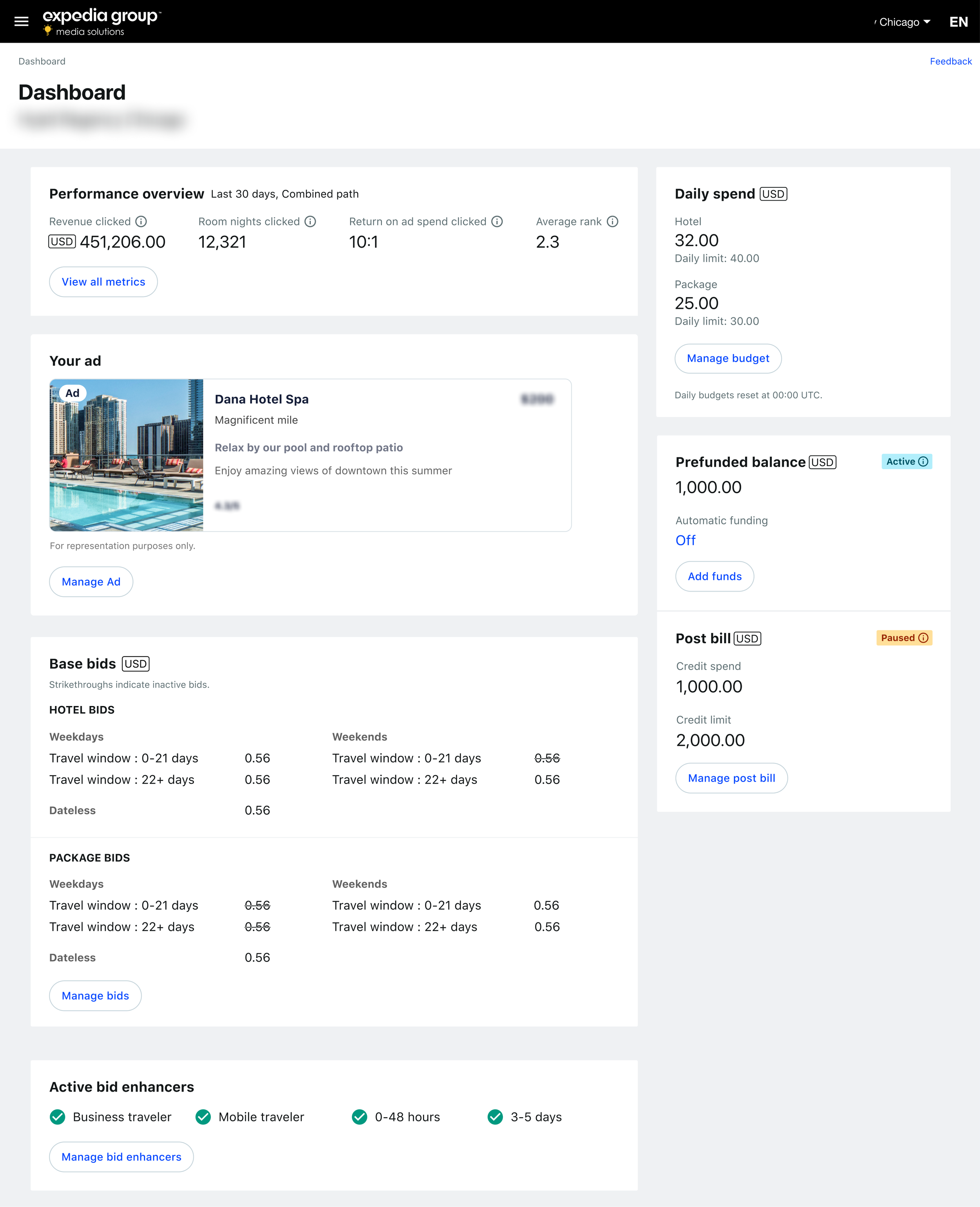
Within the constraints of the new design system, we leaned on key metrics so partners could read performance at a glance instead of parsing tables.
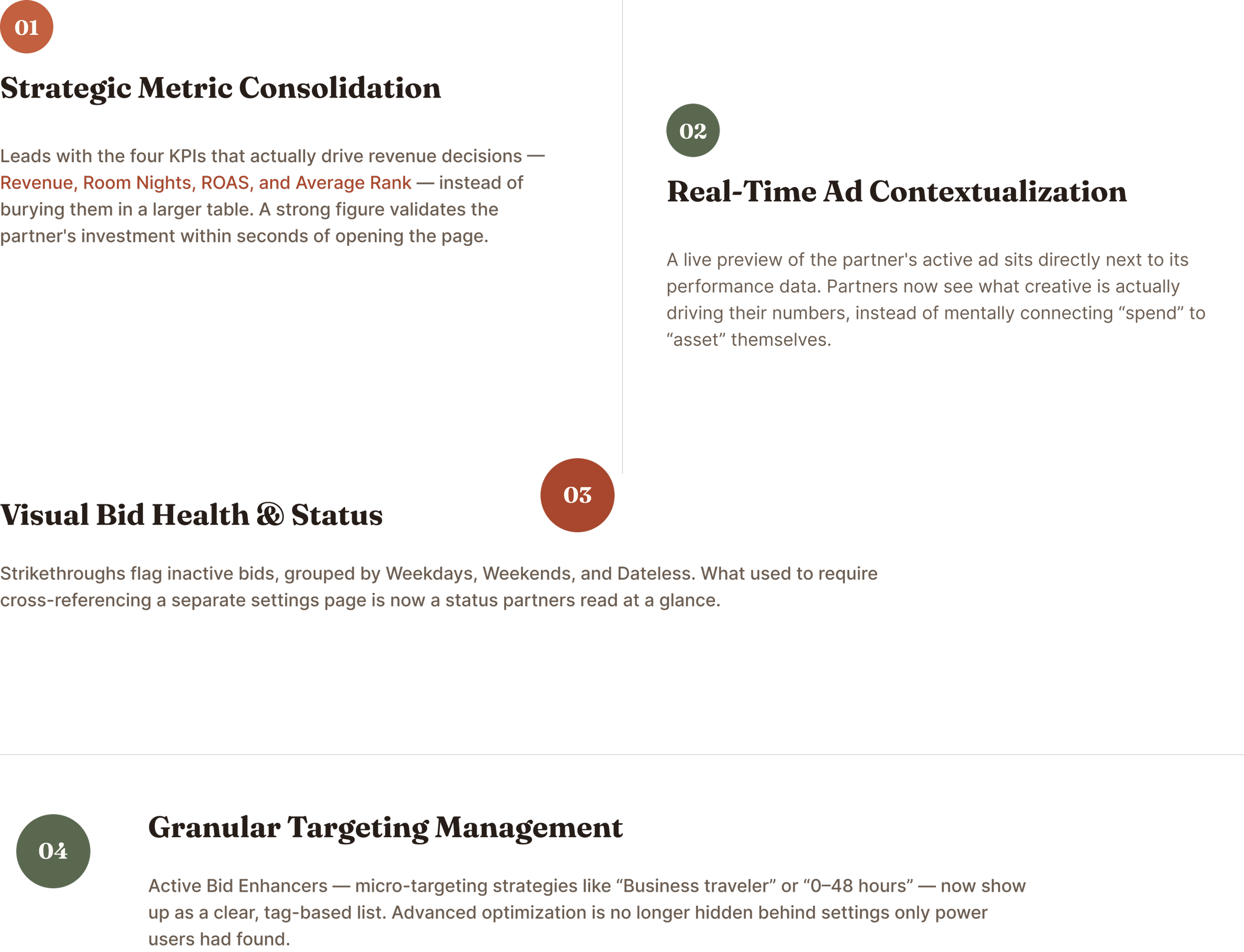
The Solution: A Command Center, Not a Report
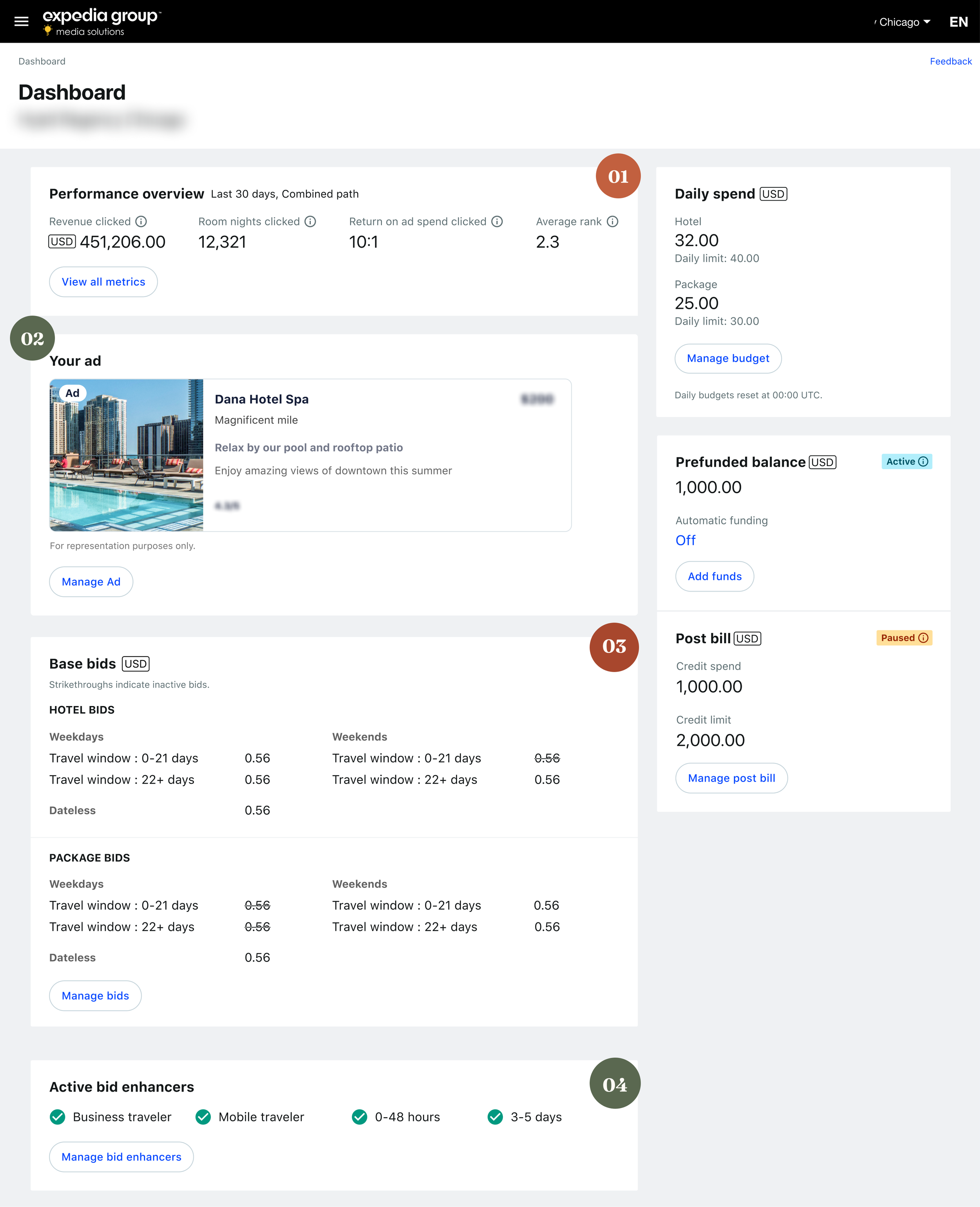
The final design turned the dashboard from something partners checked reluctantly into a tool they returned to.
The Impact
Reflection
This project changed how I think about data design: the most complete dataset is worthless without context, and the fastest way to reduce support load isn't a help center, it's a product that explains itself. Reframing the dashboard from a report partners had to interpret into a narrative that interpreted itself for them is what turned a cost center into a growth lever.
Given more time, I'd push further into predictive insight, forecasting the likely ROI of following a specific recommendation before a partner acts on it, rather than only showing the impact of decisions already made. That's the next layer of trust this dashboard needs to build.