

A simpler experience to inclusive and charitable giving all in one app.
Overview
As an advocate of social causes, I often found it frustrating to fill out lengthy online donation forms, let alone deciding which organization to give through. Generosity was created to help enable supporters of social causes in having a simpler charitable giving experience.
This app is meant to help alleviate the pain in searching for a reputable organization, the checkout process when donating and managing donation transactions.
Role: UX, UI, research, usability testing
Time: Two months
Tools: Figma, Invision, Adobe Illustrator, Miro
Prototype: Click here to view
Problem
Finding and giving to causes is a lengthy and time consuming process through current methods--website, social media and paper mail-in. Causes are scattered, searching for a reputable organization takes time, donation checkout is a lengthy process and keeping track of the transaction is difficult.
“Imagine supporting various causes, where all you had to do was simply enter your giving amount and receive a receipt of your transaction in one place.”
User goals
Provide a simple experience to global giving, alleviating pain points of supporters in their journey from the moment they need to give to a cause to locating their transaction.
Business goals
Centralize the array of causes in a secure and simple channel that creates an emotional and trustful connection, with an easy checkout process that brings supporters back for a genuine giving experience.
Research approach
The product’s target users are professional adults who support causes, and non-profit organizations searching for opportunities to expand their collection channels and reach a wider audience.
I conducted 7 interviews with people from the two user segments to better understand their donation experience, pain points and any needs felt through the process. I also wanted to validate assumptions on the current donation experience and need.
2 user segments. 7 interviews total.
Learnings from research
Supporters needed an emotional and trusted connection to give to a cause. They feel the need to be better informed during their donation experience to move forward in the process.
Transparency on how their donation was spent, legitimacy of campaign and organization, and a fast secure checkout impacts their decision in supporting a cause. Having an easy and accessible method of tracking the history of their transactions is of value to supporters.
Common patterns from interview insights
I synthesized the insights captured from the interviews using an infinity map on a digital whiteboard, Mural. I grouped and analyzed the most salient insights into three categories: Donating experience, pain points and things that helped. I garnered the following conclusion from this exercise.
Key pain points inhibiting supporters in the process and what motivates them.
Competitive advantage
I reviewed the three most popular charitable giving apps in the app store determining which features made them unique and how intuitive is their check out process.
What’s missing?
Lack of information on the organizations running the campaigns.
Array of global campaigns in one place.
Tracking history of donation detailed with receipt.
Mapping out the experience
From the insights and data learned in the research phase, I created a journey map entailing the experience of the core user-- an adult professional who wants to make an impact by supporting causes they care about.
The user journey map captured the current experience of the core user and emotional results during each stage of needing to support a certain cause. This helped me further empathize with the target users and identify opportunities the app can address to facilitate the experience.
Core user journey demonstrating key moments in the scenario of supporting a natural disaster that occurred abroad.
Afterward, I began designing a sitemap to determine the navigational structure and information architecture of the app. I also began crafting a user flow to map out the target users’ experience for achieving their primary goals inside the app. I emphasized efficiency and simplicity throughout each step and action of the user.
In the making of Generosity
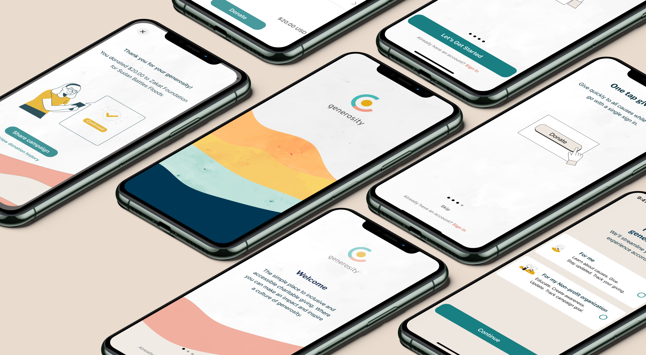
From the conclusions of the user flow and inspiration pulled to study user interface patterns of popular apps, I began constructing the ideal experience in mid-high fidelity wireframes, capturing the flow and real content of the main screens needed for the core user to achieve their goal.
Due to time constraints, I didn’t get to conduct user testing on the wireframes. However, through my mentor’s critique, we were able to pinpoint areas of improvement and made iterations accordingly.
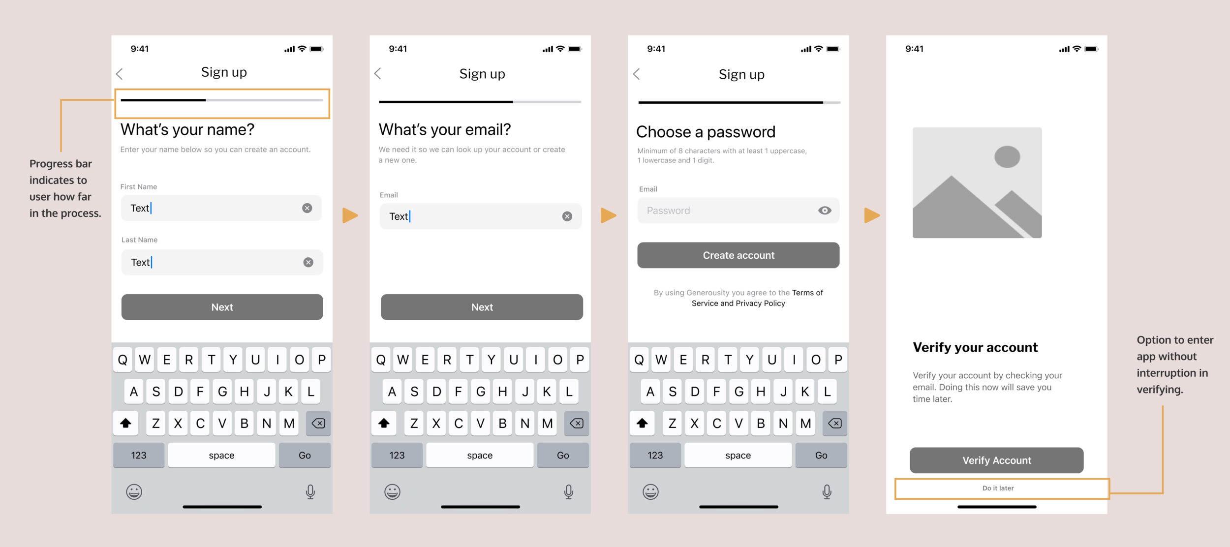
Iterations made to the sign up (top) and payment process (bottom).
Mockups
After iterating on the wireframes, I translated it into mockups using the design system I created for the new app inspired by the Atlantis and Material design system.
The designs focused on a seamless onboarding and sign up, a clear path to finding choice of cause through a categorical display, search and filter options, fast checkout process and visual summary of transactions with receipt. After iterating on the wireframes, I translated it into mockups using the design system I created for the new app inspired by the Atlantis and Material design system.
The designs focused on a seamless on-boarding and sign up, a clear path to finding choice of cause through a categorical display, search and filter options, fast checkout process and visual summary of transactions with receipt.
Test, learn and iterate
To test out the experience and identify any usability issues, I prepared a prototype from the mockups for a moderated usability test session. This was a crucial step in the making of the app where real users had a full walk through of the app and issues became apparent in the experience, realizing the app did not deliver its purpose entirely.
Results
The results uncovered user pain points and needs disrupting areas of the experience and can impact engagement, retention and activation of the app. The users' feedback helped me get to the root of the problems and how they can better achieve their goal.
Moderated remote user testing results from five participants.
Analyze, iterate and retest
One of the greatest challenges was figuring out how to reshape the most troubling areas of the experience with benefit to the user.
I first analyzed and prioritized the results of the usability test on the Mural whiteboard. I also included some possible solutions based on recommendations from testers and studying existing solutions from popular apps.
Iterations after applying data from the user testing results and retesting to improve the experience of the on-boarding, campaign, tracking and checkout process.
MVP: Engaging, seamless and organic experience
I made a clickable prototype. Click here to view clickable prototype.
The journey continues
Results
Although Generosity is still in the making, the MVP was well received during testing stages. The value and benefit was validated in the research and testing by users and stakeholders expressing the need and desire for a centralized, trusted and simple giving experience .
Lessons learned
This was my first time designing an end-to-end app, wearing all the hats in the design process. I was excited and nervous for there were many challenges and lots to learn along the way. I learned proper planning is key, but always be prepared to pivot, alter and refine. I may not have had the time and resources to dig deeper, but understanding the process and learning from the people it impacts were profound moments in my journey.
“Your UX process is not a ritual…sure are proven steps that generate the best outcomes but thorough understanding of the relevance of each step is the key to amazing experiences….know when to do what
and how.” William Ntim
Next steps
The road to product improvement and exploring awaits. There's still some things that were left undone. What is the ideal experience for a non-profit organization adding and updating their campaign? What if the supporter wanted to set a giving goal? How else can the experience be personalized?
I’m looking forward to continuing the work, learning and strategizing for launch, hoping the fruition of this project can contribute to the problem and benefit many.